


林記糕餅舖 Lin Homely Bakery | 品牌設計 Branding
Concept
屹立於傳統黃昏市場,將溫暖與日常,揉進一顆顆蛋黃酥裡
Originating from the traditional evening market in Changhua,
"Lin Homely Bakery" infuse warmth and everyday life into each and every egg yolk pastry.
"Lin Homely Bakery" infuse warmth and everyday life into each and every egg yolk pastry.
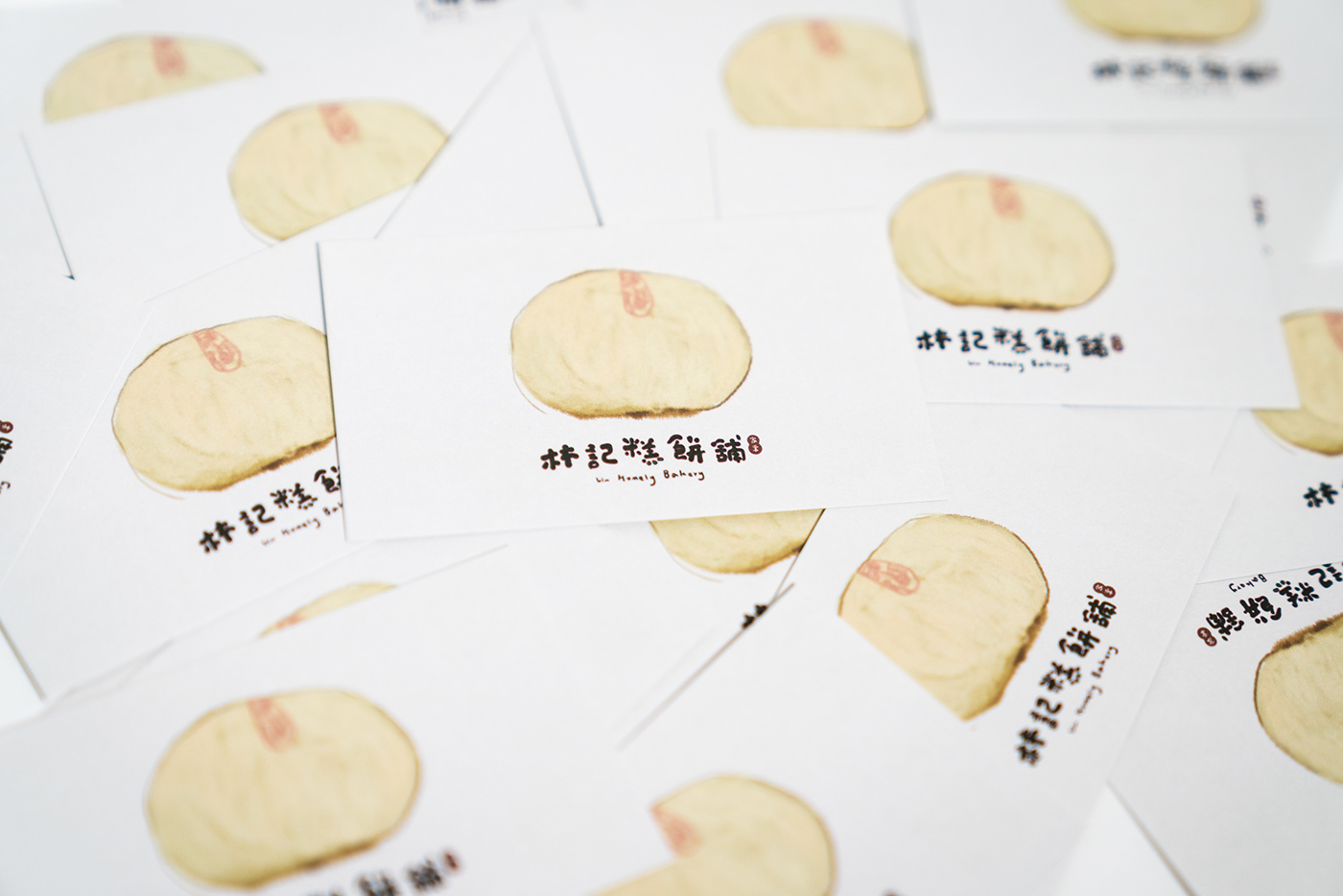
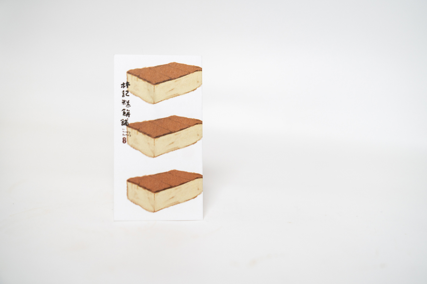
帶著暖意的溏心蛋黃色,和著米白色麵團,營造親切家常的品牌氛圍。溫暖的筆觸勾勒一顆顆招牌蛋黃酥、綠豆椪和家常蛋糕,躍身名片、店卡和包裝,用看的彷彿就能感受到美味。貪吃的柴犬宅宅,化身品牌大使,在林記糕餅舖線上線下每個角落,親切地招攬客人,一同饗用飄香20年的好滋味。
林記糕餅舖由林40多年烘焙手藝的林師傅領軍,以做給女兒吃的心意,製作每一個高規格品質的傳統糕餅;而三個新世代的女兒認為自家糕點擁有高品質,即便隱身於傳統黃昏市場,經由品牌規劃設計,便能讓更多消費者看見與接受。
林記糕餅舖由林40多年烘焙手藝的林師傅領軍,以做給女兒吃的心意,製作每一個高規格品質的傳統糕餅;而三個新世代的女兒認為自家糕點擁有高品質,即便隱身於傳統黃昏市場,經由品牌規劃設計,便能讓更多消費者看見與接受。
堅持嚴選原料、有家的味道與溫度,製作給家人吃的家常味道,不過甜、不過油且不膩口,喧騰熱鬧的黃昏市場裡,林記糕餅舖一貫陪伴每個日常。每個叫人垂涎的金黃色糕點背後,都是樸實、重內在、厚感情的傳統心意。
With a warm egg yolk center, kneaded the creamy white dough, we create a cozy and homely atmosphere. The strokes of warmth delicately outline each signature egg yolk pastry, mung bean mooncake, and traditional homemade cake, adorning business cards, store cards, and packaging, allowing you to almost taste the deliciousness just by looking at them. Our food-loving Shiba Inu, serving as the brand ambassador, warmly welcomes guests, online and offline, inviting them to savor the delightful flavors that have been enchanting taste buds for 20 years.
Led by Master Lin, who has over 40 years of baking experience, Lin Homely Bakery creates each traditional pastry with meticulous craftsmanship and heartfelt intention, originally made for his daughters. The three daughters of the new generation believe in the high quality of their homemade pastries, even though they remain hidden within the traditional evening market. Through strategic brand planning and brand identity design, they aim to make their offerings accessible to a wider range of consumers.
With a commitment to selecting premium ingredients and capturing the taste and warmth of home, Lin Homely Bakery produces homemade flavors that are neither too sweet nor too greasy, providing a delightful experience without overwhelming the palate. Amidst the bustling and vibrant evening market, Lin Homely Bakery remains a constant companion in the everyday lives of its customers. Behind each tempting golden pastry lies a traditional sentiment that is humble, substantial, and deeply rooted in genuine affection.
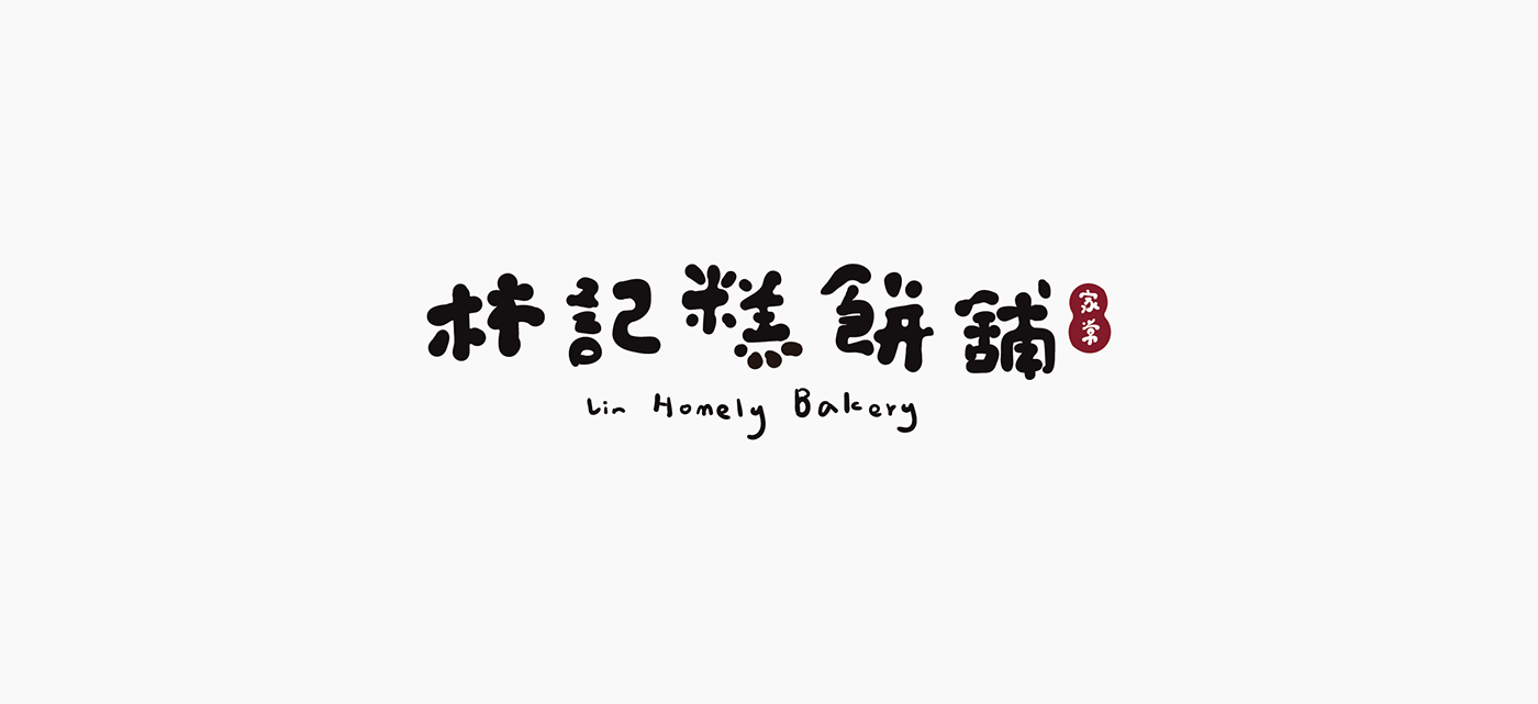
"林記糕餅舖"手寫字樣是標準字、也是品牌的主視覺元素:一筆一畫宛如手擀、揉捏、塑形等一道道製餅所需的繁複工序,兼具情感與視覺厚度的字樣,傳遞著家常般地輕快隨意。
The handwritten logo of "Lin Homely Bakery" is both the standard font and the main visual element of the brand. Each stroke resembles the intricate processes involved in making pastries, such as rolling, kneading, and shaping. The logo conveying a casual feeling, reminiscent of home.


Credit_
Client | 林記糕餅舖 Lin Homely Bakery
Designer | 陳瑋姿 Wei-Tzu CHEN
Designer | 陳瑋姿 Wei-Tzu CHEN
Photography | 陳瑋姿 Wei-Tzu CHEN
2019


